Spatial design of the exhibition Fashioned from Nature co-curated by V&A and Design Society
海上世界文化艺术中心V&A“源于自然的时尚”展览空间设计
Credits
Location: Sea World Culture and Arts Center, L1 Main Venue, 1187 Wanghai Road, Shekou, Nanshan, Shenzhen, China
Status: Completed December, 2020
Exhibition Duration: December 19, 2020 - June 6, 2021
Area: 1280 sqm
Curator: Design Society, Victoria & Albert Museum (V&A), China Silk Museum
Guest Curator: Edith Cheung
Design Consultant: Studio 10
Principal-in-charge: Shi Zhou
Design Team: Cristina Moreno Cabello, An Huang, Jiaying Huang, Meishi Zhao, Xin Zheng, Jiaxiao Bao (Project Assistant), Feifei Chen (Project Assistant)
Graphic Design Consultant: SANYI_Lab
Construction Drawings Consultant: SHENNAN Design
Lighting Consultant: JOJO Lighting
Photographer: Chao Zhang
Studio 10 Wechat/Instagram: studio10design
项目信息
项目地址:中国深圳市南山区蛇口望海路1187号海上世界文化艺术中心一层主展馆
完工时间:2020年12月
展期:2020年12月19日-2021年6月6日
面积:1280平米
策展方:设计互联、英国V&A博物馆、中国丝绸博物馆
客座策展人:张西美
展览设计顾问:Studio 10
主管合伙人:周实
设计团队:Cristina Moreno Cabello、黄安、黄嘉颖、肇美施、郑鑫、包嘉晓(项目助理)、陈菲菲(项目助理)
平面设计顾问:三一创意实验室
施工图设计顾问:深圳深楠室内设计有限公司
灯光顾问:佐希照明
摄影师:张超
Studio 10微信/ Instagram: studio10design
The spatial design of the exhibition Fashioned from Nature co-curated by the Victoria & Albert Museum (V&A), China Silk Museum, guest curator Edith Cheung and Design Society is an abstract yet poetic interpretation and comparison of the Eastern and Western Views of Nature, as well as the evolution from classical through contemporary garden spaces.
The exhibition consists of two sections: "FASHIONED FROM NATURE" curated by the V&A Museum and Design Society narrates the complex relationship between fashion specific to human society and nature since the 16th century, with reflections as well as an emphasis on environmental sensitivity and preservations, while the FASHIONED FROM NATURE IN CHINA: THEN AND NOW Section is an echo to the theme in the east.
The spatial design of the exhibition has chosen nature as the subject and “garden” as the theme. We hope to explore the similarities and differences of the natural views embodied in Eastern and Western gardens through the exhibition spatial design.
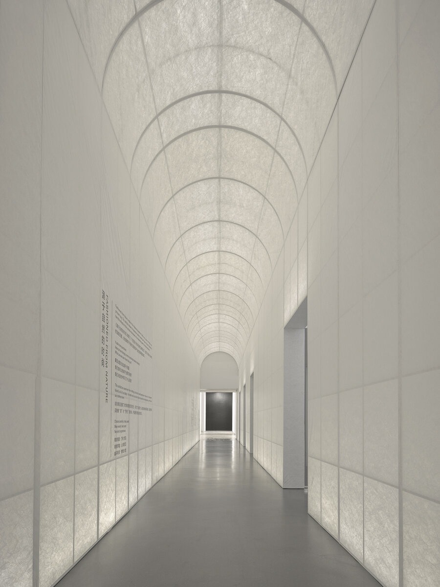
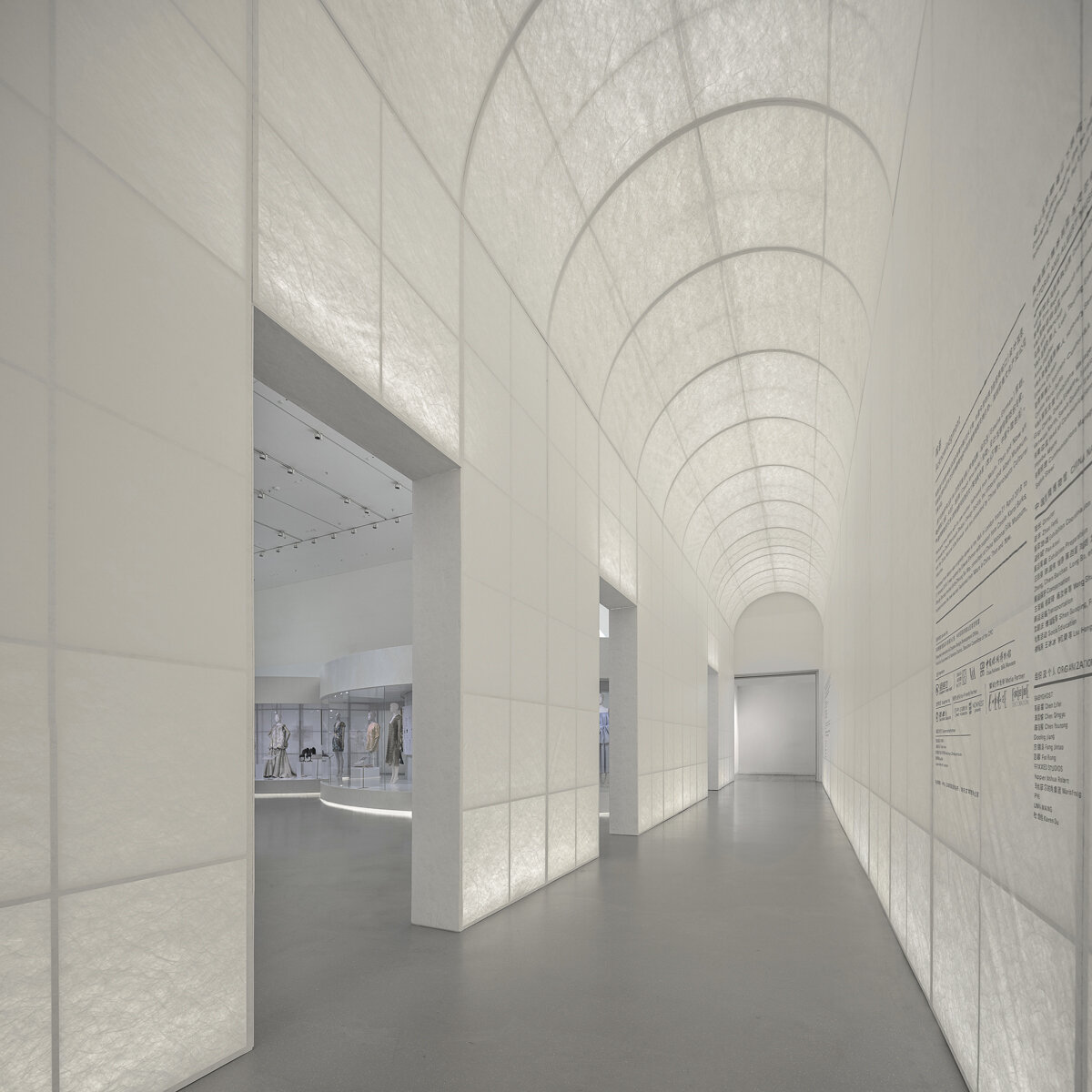
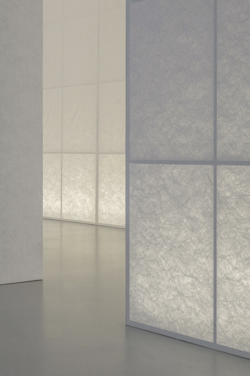
The entrance archway is finished with Tyvek. When backlit, it faintly reveals the vine-like fibers, forming an abstract “green corridor”.
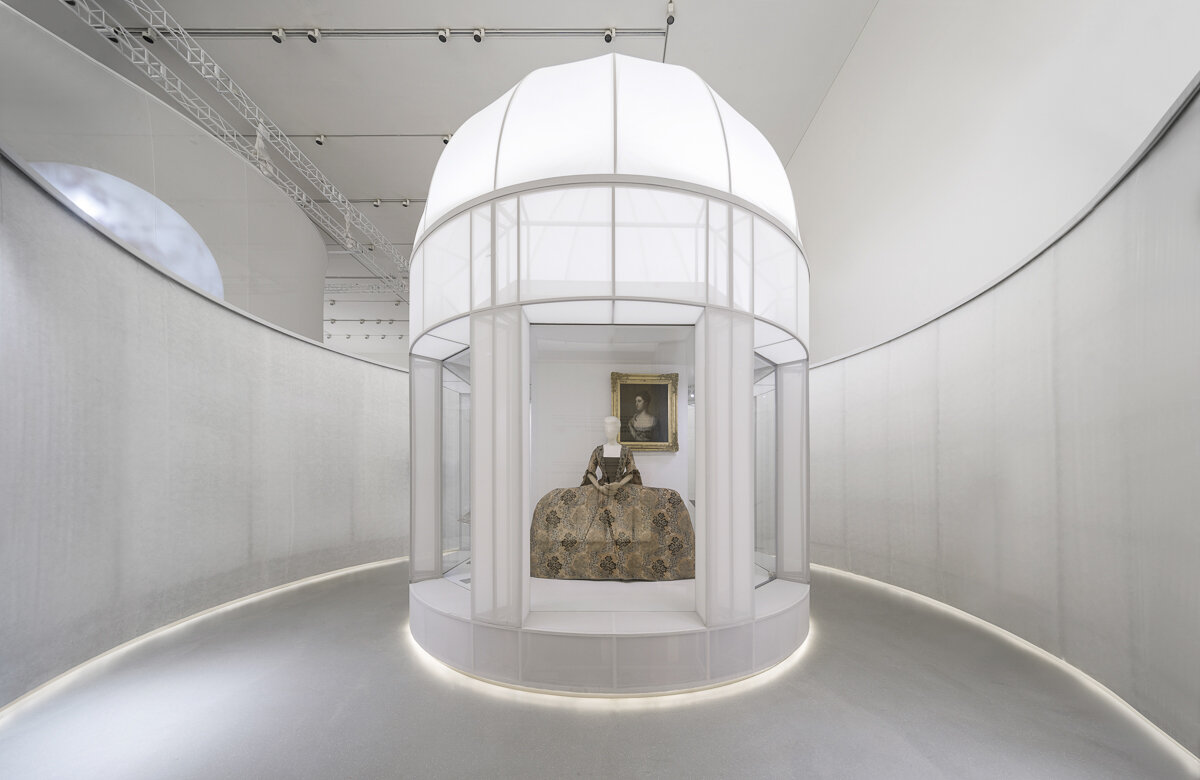
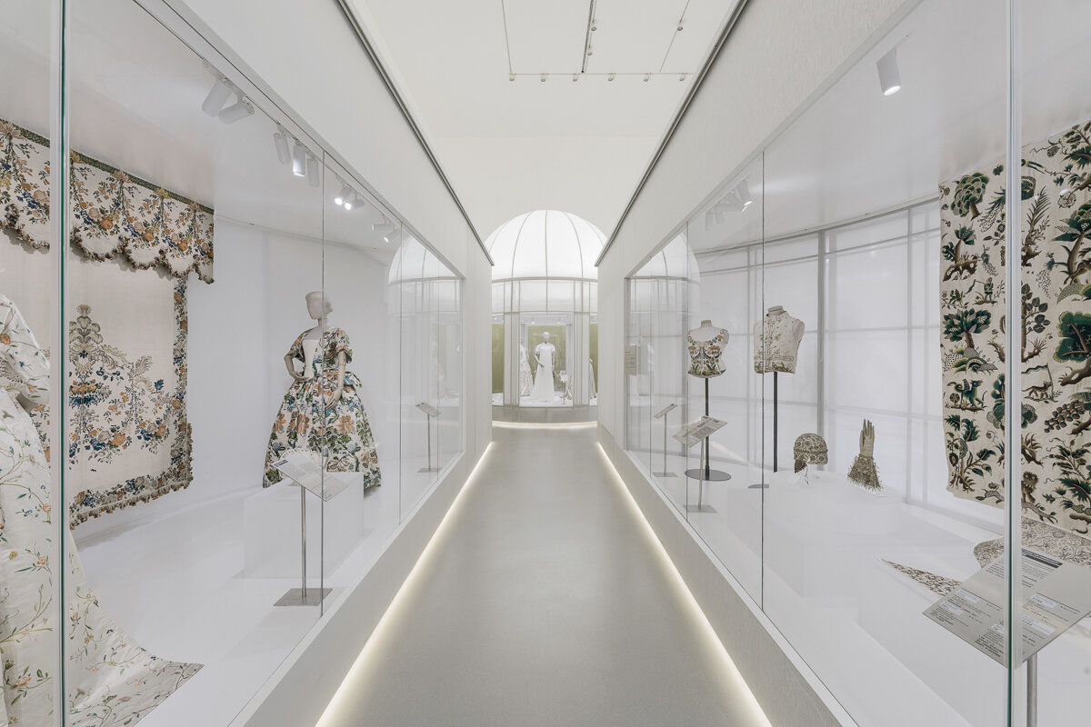
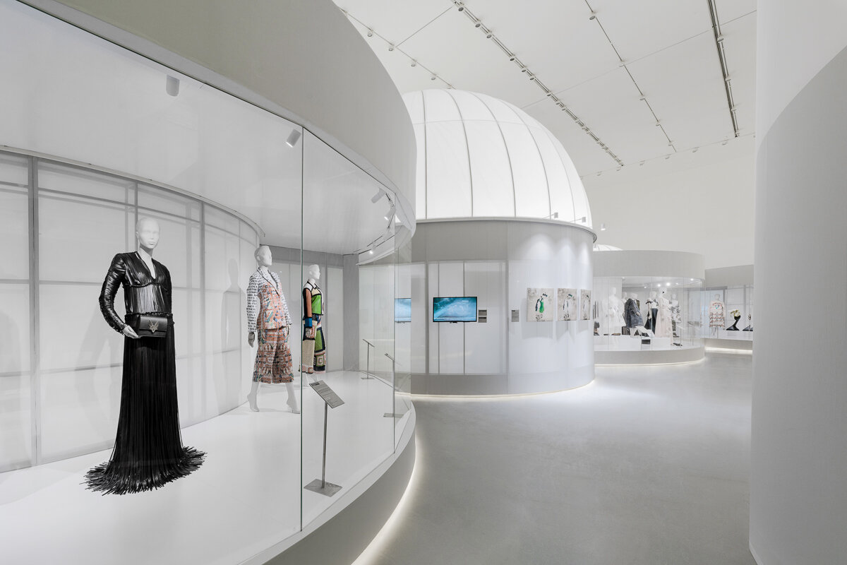
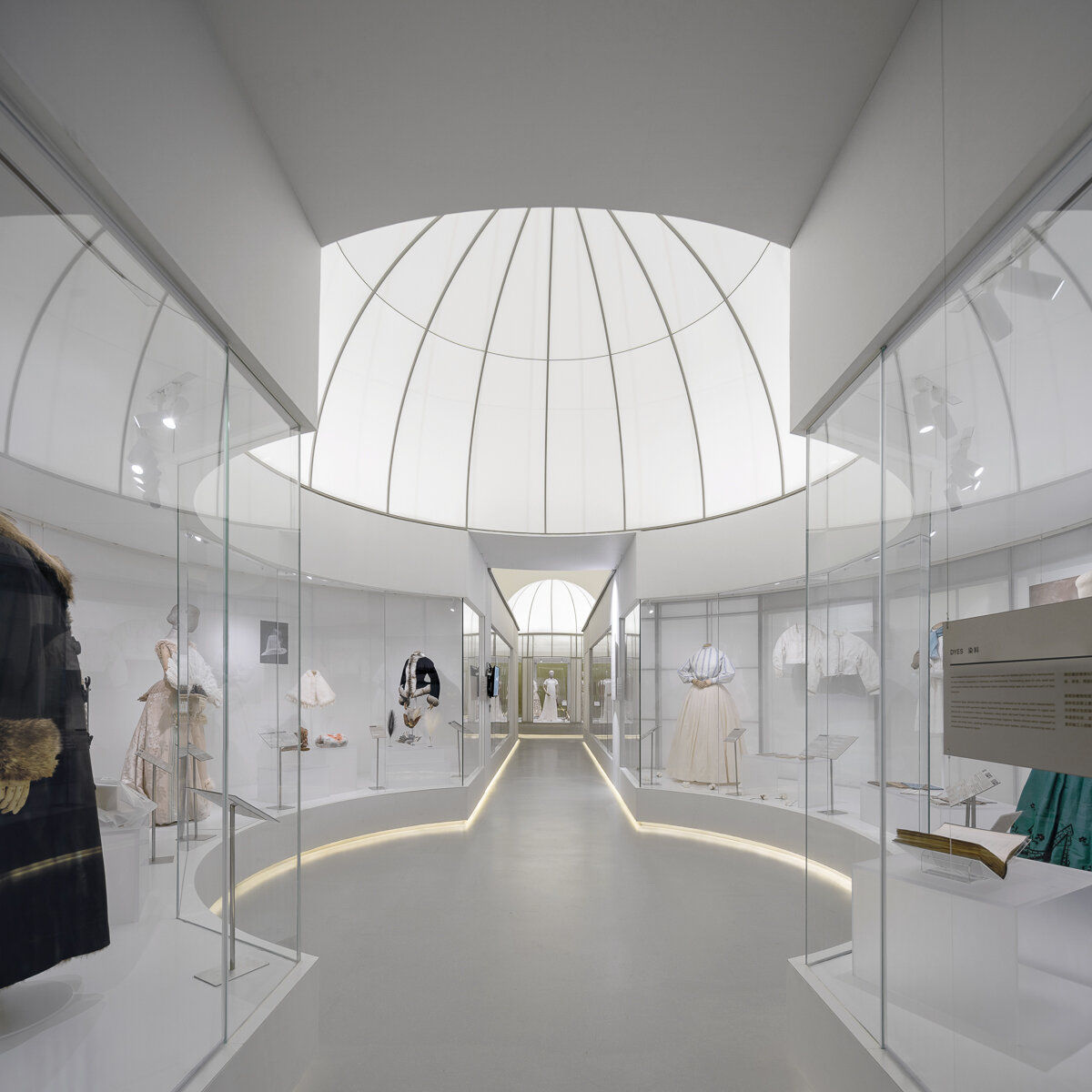
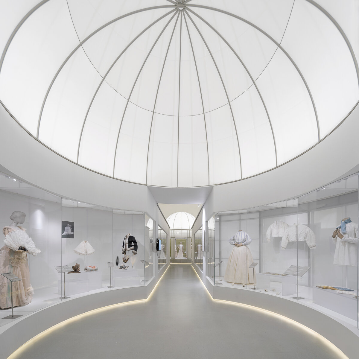
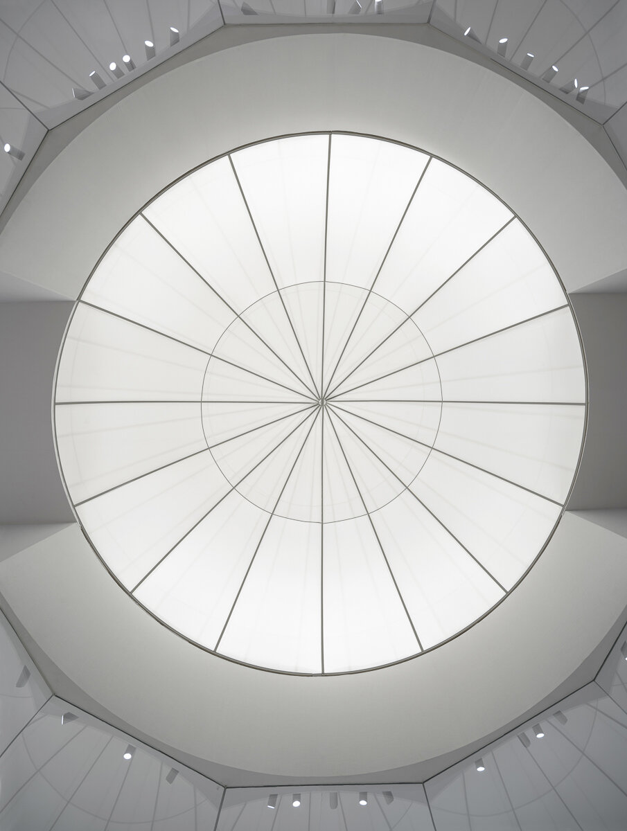
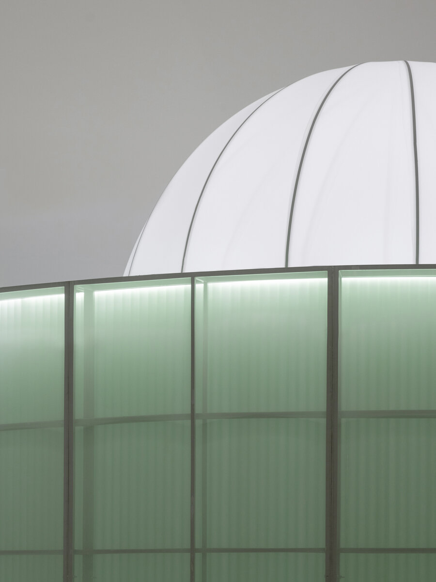
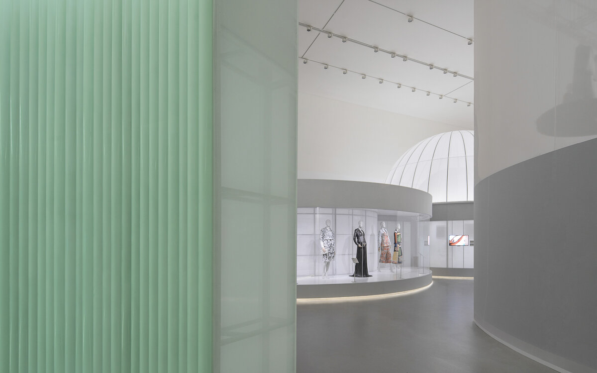
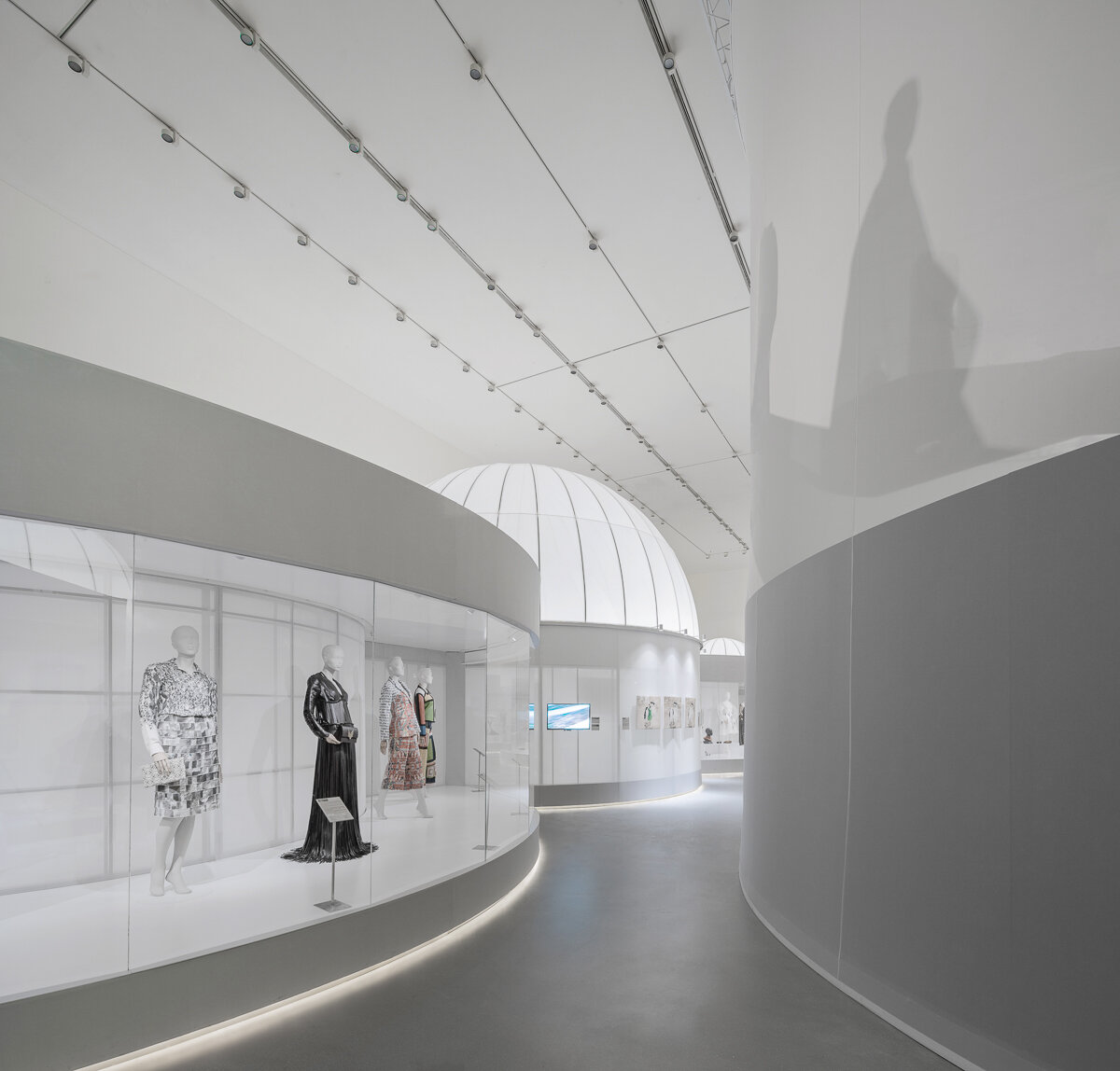
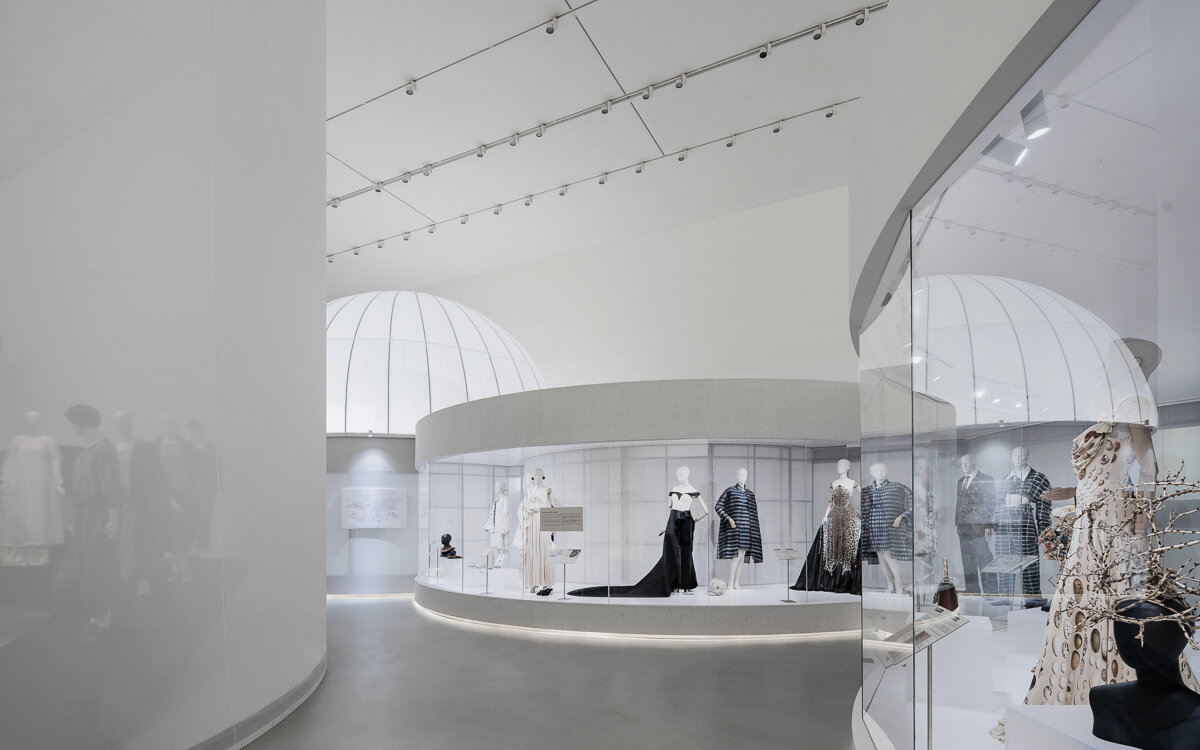
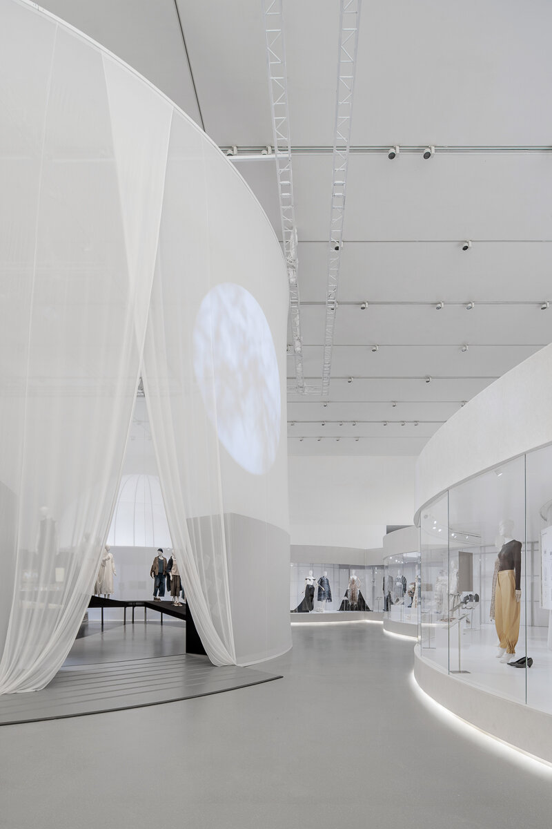
Through the green corridor, enters the first section of the exhibition, the classical period of the English section. Translucent fabrics are used to create an abstract “Western” classical garden, which is highly geometric, axially symmetrical, and perspective-driven while connecting circular spaces and showcases of different sizes through the axis. Just like the emphasis on the relationship between architecture and axis in Western classical gardens, there are three circular “Garden spaces” placed in the vanishing points, which are also the intersection of the axis. The three abstract and volumetric 360-degree circular independent showcases are used for displaying highlight objects.
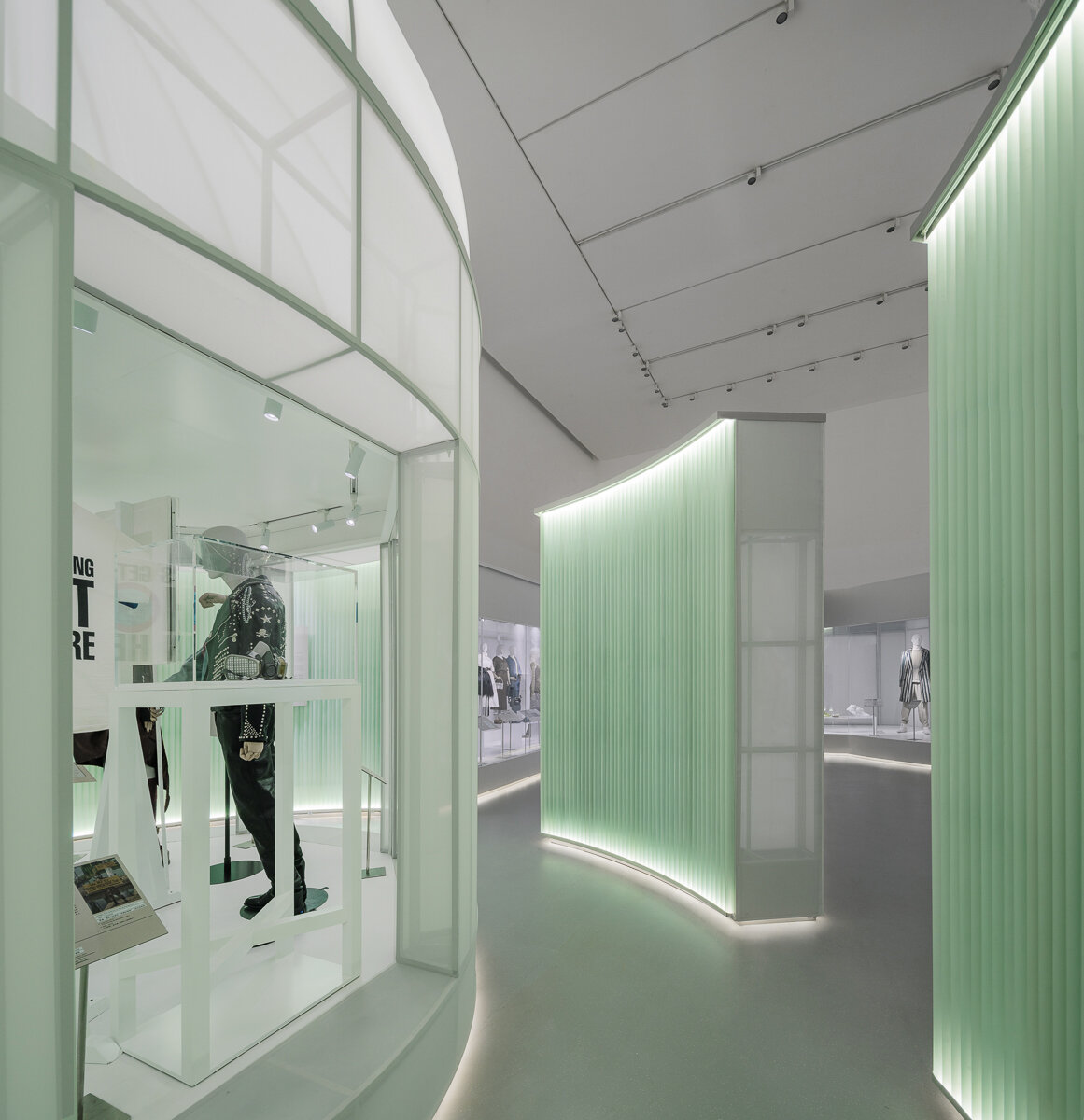
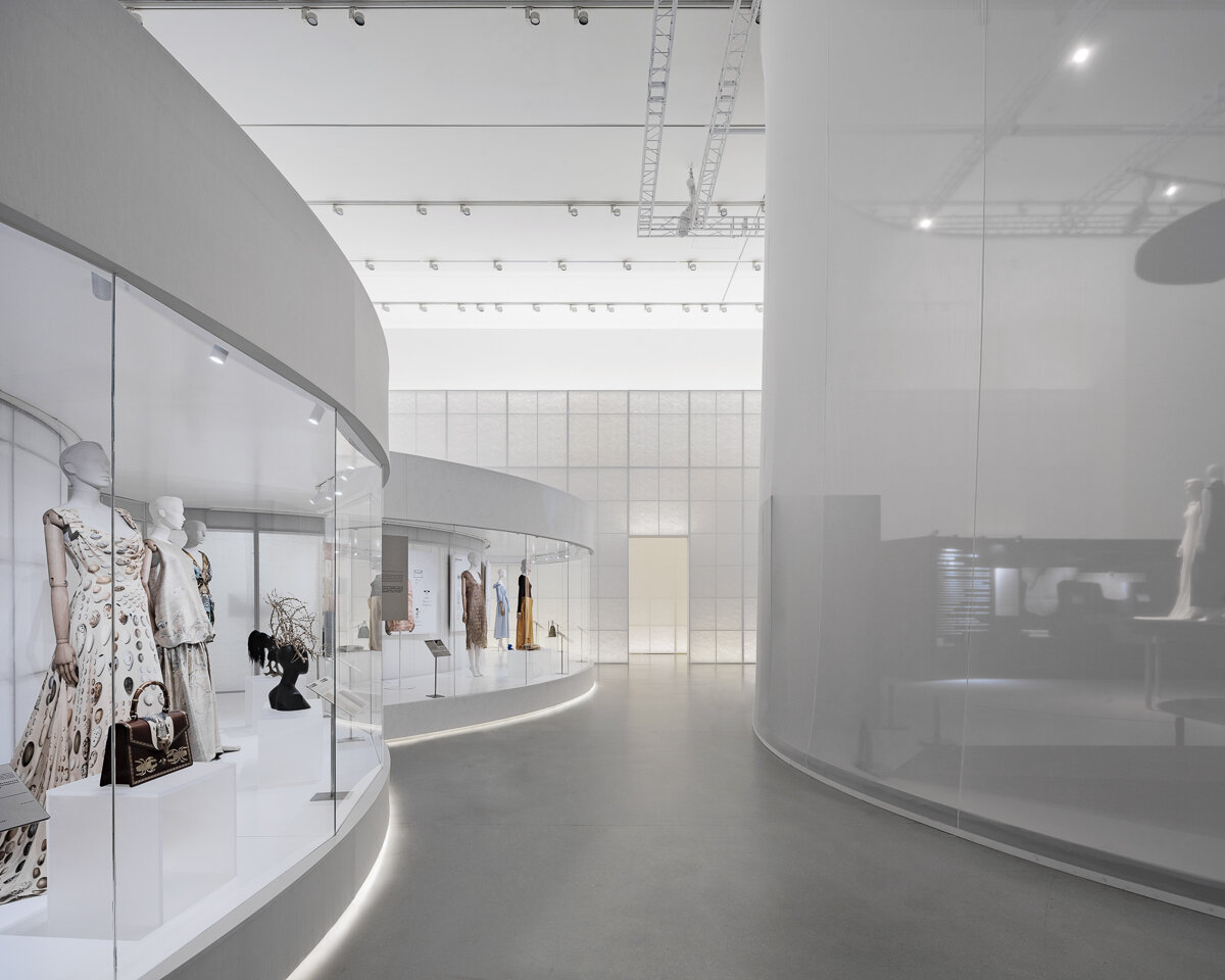
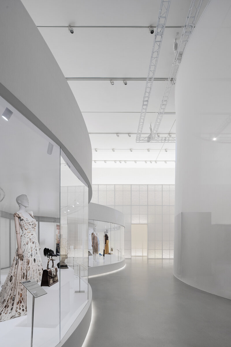
Then comes the last garden, which is formed by an array of acrylic tubes. The modern material implies that the narrative of the exhibition is coming close to modernity, where people began to contemplate and reflect on the relationship between fashion and nature. From there we enter the contemporary and prospects of the exhibition, the space instantly opens up, from classical confined circular showcases to one continuous, free-flowing showcase, echoing the flexible layout of contemporary landscape and spatial design.
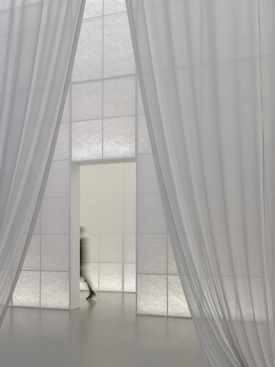
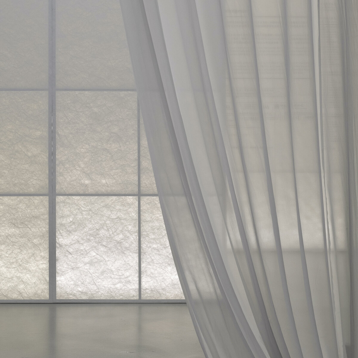
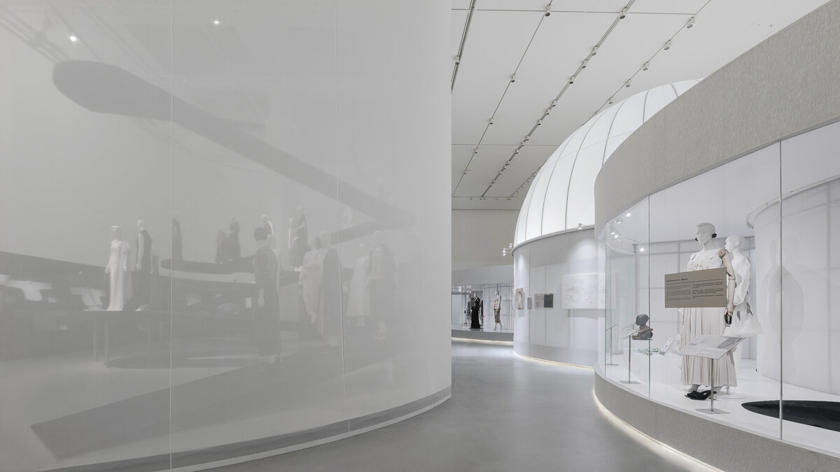
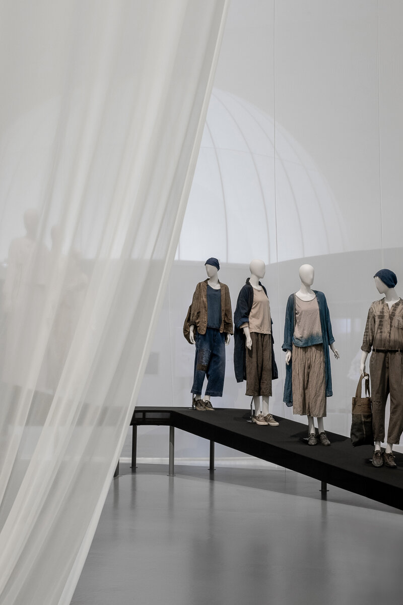
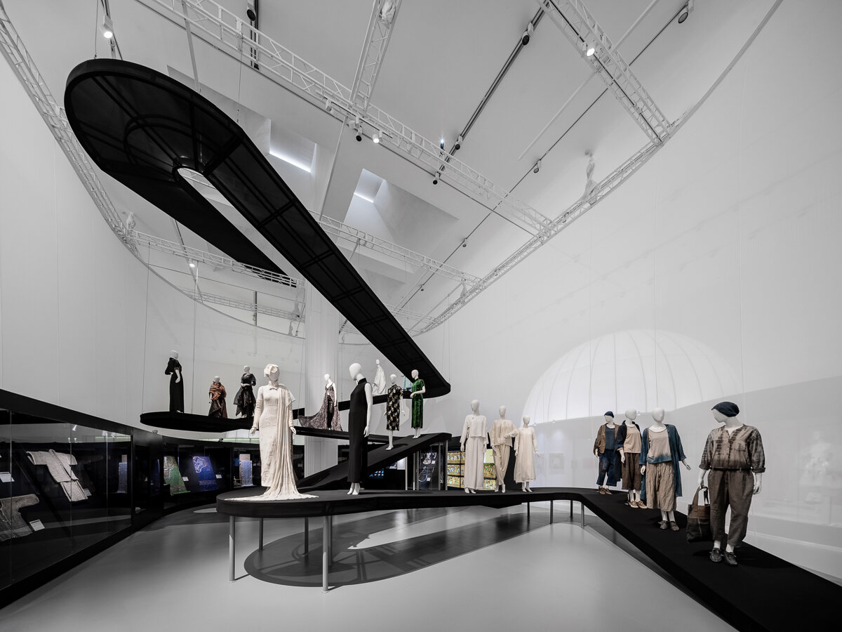
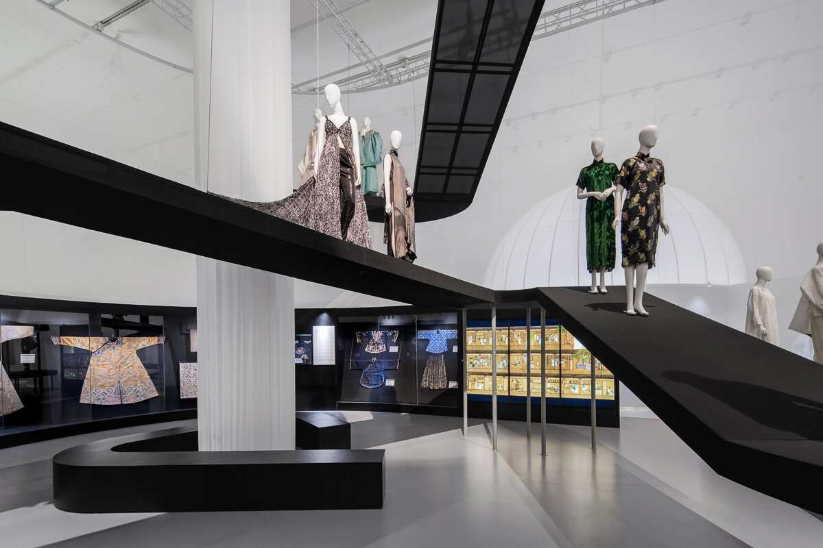
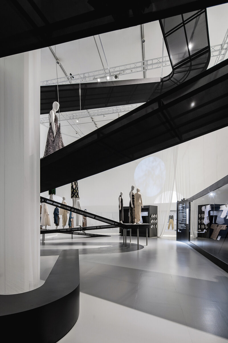
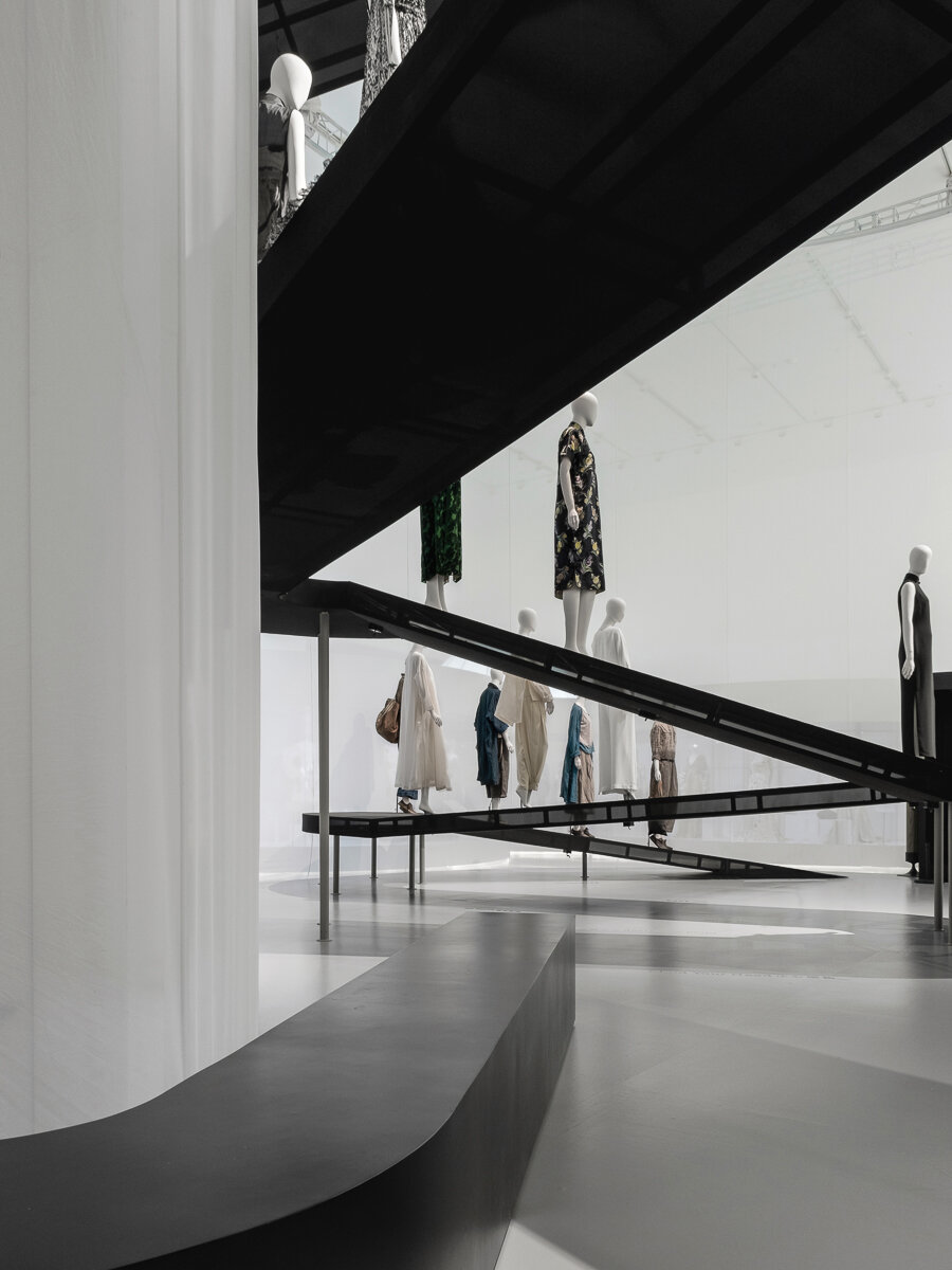
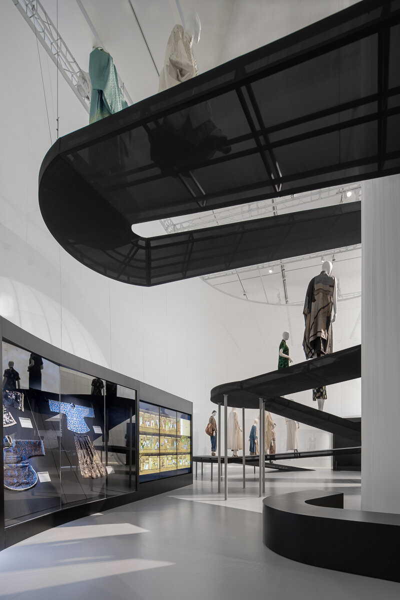
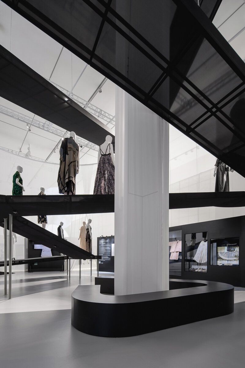
The Chinese section is the end of the exhibition, a pill-shaped plan enclosed with translucent fabric, leaving only a slit for the entrance. Visitors can vaguely see whilst wondering in the V&A section, which is a process of curiosity accumulation. In this section, the spatial design follows a natural approach - there is no axis or fixed linear circulation. A translucent ramp sits in the space, just like a mountain trail or stream meandering down from the sky, free and winding. The models dressed in showcased pieces are placed on the ramp, as if they are walking down the mountain trails. Visitors can roam around the space intuitively and freely, as if they are in a romantic and poetic nature setting.
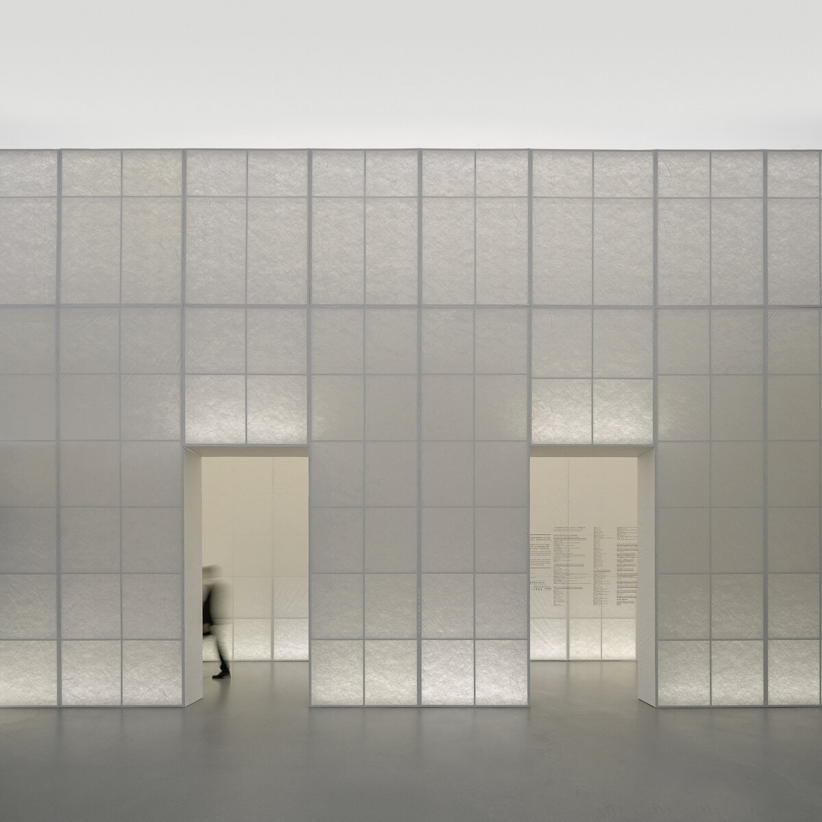
The exhibition uses lightweight and translucent materials such as fabric, TPU, Tyvek, etc. to weaken the interposition of physical space and the existence of entity; expressing Eastern and Western, classical and modern garden’s abstract and poetic views through “void” and “translucency”, we intend to inspire visitors to ponder and reflect upon the relationship between human and nature from fashion and a broader perspective.
“源于自然的时尚”展览空间设计试图对于东方和西方、古典和当代的自然观及园林空间形式演变进行抽象地解读和诗意地诠释。
展览分为两部分,英国V&A博物馆和设计互联联合策展的“源于自然的时尚”部分从西方的视角,展示了自16世纪以来人类社会“时尚”与自然的复杂、交互关系,表达了对于环境保护的关注和展望;由丝绸博物馆、张西美老师和设计互联联合策展的“衣从万物”板块则是对于这一主题在东方的遥相呼应。
展览空间设计也以自然为主线,选取“园林”作为主题;追根溯源,园林属于哲学意义上“第三自然”,即“美学的自然”;因此,“时尚”与“园林 ”都体现了作为创造主体的“人”的世界观和价值观,而我们也希望借展览空间探讨东西方园林中体现的自然观之异同。
展览入口的拱廊以带有纤维的杜邦纸作为饰面材料,背光隐约透出植物“藤蔓般”的肌理,形成一座抽象的“绿廊”。
通过绿廊,由此进入展览的第一部分,即英国的古典和近代时期展区,我们以半透明的织物打造了一座提炼、抽象的“西方”古典园林原型:它是高度几何化、中轴对称且极具透视感的,以轴线串联大小不一的圆形空间和展柜;正如西方古典园林中对于建筑和轴线关系的强调,在空间视线的终点、也是轴线的交点设有三个圆形的“花园空间”,三座抽象而具有体量感的360度圆形独立展柜分别矗立其中,用于展出高光展品。
古典部分的最后一个花园是由亚克力管排列围合而成的,现代的材料暗示着展览叙事已近现当代,人们开始对于时尚与自然关系进行深刻反思。由此进入展览的当代和未来展望部分,空间豁然开朗,古典空间圆形展柜的背面形成了连续、自由流动的大型连通展柜,也呼应了当代景观和空间设计更自由灵动的布局。
中国展区是展览流线的终点,四周以半透明薄纱围合,只在一角留有入口。人们在参观英国部分时可隐约窥视,也是好奇心逐渐积累的过程。这部分的展览空间师法自然,不设轴线,不拘于定法,也没有固定的线性流线。在空间中设有一条半透明步道,仿佛山间小径,从天上蜿蜒而下,自由而曲折。身着展品服饰的模特站在步道上或站或坐,仿佛在山中游览的人。观展者在空间中漫游,也仿佛置身浪漫、诗意的自然,随心而动。
整个展区多采用轻盈、半透明的材质,如织物、亚克力、TPU、杜邦纸等,弱化对物理空间的介入及实体的存在感,以“虚空”和“半透明”体现东西方、古典和现当代园林的抽象与诗意,也期待启发观展者从时尚乃至更广阔的视角对于人类和自然关系进行深层思考和反思。

